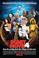
We have started to think about posters for our film. To inspire us for ideas I have decided to look at posters for films of similar genre to ours. I have looked at three posters: Shaun of the dead, Scary movie 4 and Zombie Land.
I think this poster is really effective. It takes key points from the film and puts this onto paper. I like the idea that Shaun and the gang try to escape the zombies in the films and that the poster is almost a poster in a poster with a sense that Shaun and the Title is the poster part and that the zombies are trying to drag Shaun out of this safe place. I also like the fact that the font which is a simple bold white capitalised writing is made effective by making it slightly tattered and having a Zombie hand in the middle of the A.
 Zombieland is also an effective poster. The font just like Shaun of the dead is relevant to the film. I imagine the title font to be on the front of an amusement park or ride, which is relevant to the film. The font is curved as to suggest that it is on a spinning globe or something similar. Another key feature of posters which I have noticed is that they contain the main characters on the posters.
Scary movie 4s poster title font doesn't really have any hidden messages or relation to the film. In a way it adds a connection to the other scary movie films as their title font is the same in their other films.
This is the draft to our poster. We have put in a tag line and experimented with font. We shall put in a picture soon and tidy up the general poster and add some colour.
 We have loooked at general posters and one we like is the 'Me, myself and Irene' poster. We like this because it shows the main characters split personality. This would be effective for our film as we could have one half before Luke turns to a zombie and the other half when Luke is a zombie. We would also have a background of the house where they live with his wife stood outside.


No comments:
Post a Comment